

“Are we in the 6th, 8th, or 9th inning? I don’t know, but I suspect the beginning of this bull is further away than the end.” –Me, 5 days ago
I always hate the after-the-fact explanations of why the market is doing anything on any given day — but it’s hard to ignore Crude Oil over $110 per barrel,1 along with concerns about CoreWeave, and even more concerns about Private Credit Alt defaults.
Confirmation bias is rampant, and you see people cherry-picking charts that confirm their priors.
Whenever I re-read anything I wrote that might be too bullish or bearish, it sends me scrambling for disconfirming evidence. It is easy to find and share a chart that agrees with your priors, but seeking out something that 1) disagrees with your dominant concerns, 2) is from someone you respect, and 3) makes you sit up and pay attention is always difficult.
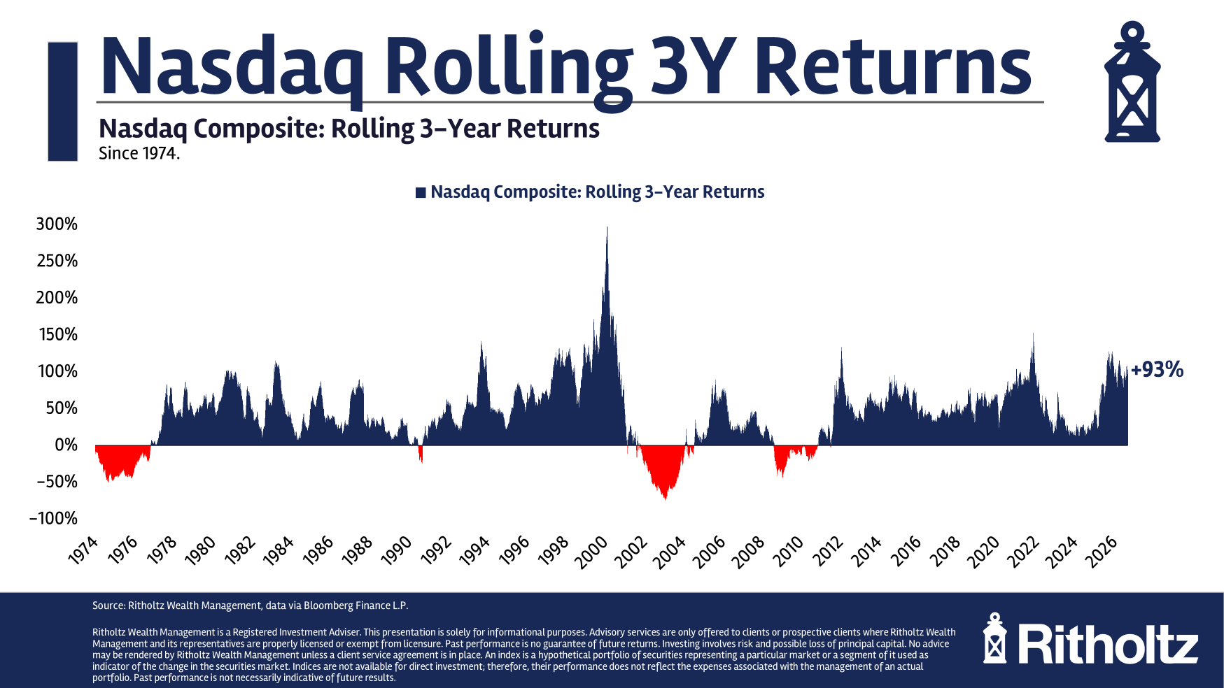
The chart at the top is by Nicholas Colas of Datatrek; it shows 3-year rolling returns for the Nasdaq.
The implication is that bubbles don’t happen overnight; they tend to be concentrated in technology; and that we are not all that close to the 2000 dotcom peak.
Ironically, we are in the fourth year of double-digit equity gains — the last time we saw that was 1996-99. But as Colas’ chart shows, the magnitude then was far greater than today.
Is this conclusive? Absolutely not.
But I find the exercise of looking for data/charts inapposite to your emotions refreshing…
Previously:
5 Steps to Take Right Now (October 12, 2026)
__________
1. I just filled up for $5.15 / gal self serve, BP Ultimate, $95 tank of gas.
